Interactive browser-based tool for visualising data across space, time, and categories using maps, timelines, charts, and genetic trees.
Features
EpiGenTracker turns tabular data (.csv or .xlsx) into an interactive map–timeline–chart visualisation. Load your sample data, play through time, compare two regions, and (optionally) explore a genetic similarity tree.
- Map: plots samples by administrative region.
- Timeline player: animate sample appearances by collection date.
- Charts: compare two regions (Area A/B) over time, grouped and coloured by assigned labels.
- Coloured by label of choice
- Genetic Tree (optional): visualize pairwise similarity from a
.tabdistance matrix. - No backend needed: works entirely offline in your browser.
- Your data is safe 🛡️. It is not sent or stored anywhere.

App version: 🐣 v0.8 @Dec 3, 2025
Citation
If you use EpiGenTracker in your work, please cite:
GenRe-Mekong. EpiGenTracker: An interactive browser app for genetic epidemiology data visualization. 2025. https://github.com/GenRe-Mekong/EpiGenTracker
User Guide
What EpiGenTracker does
- Shows each sample as a dot on a map, positioned in its district (ADM2) and animated through time.
- Lets you color samples by any category (e.g. cluster, species, drug resistance) and see trends in charts.
- Can optionally show a genetic similarity tree if you provide a distance matrix.
Files you need
Required
Everything depends on two things being consistent:
- Your map (ADM2 districts in GeoJSON) OR the preloaded Eastern GMS map.
ADM2.geojson– district‑level map (from GADM or similar).- Your sample sheet (CSV/Excel) with a column that matches the district IDs in the map and a date for each sample.
Sample.csvorSample.xlsx– one row per sample, first row = column names.
Optional but recommended
ADM1.geojson– province‑level map (for nicer borders and labels).ADM0.geojson– country‑level map.- Genetic distance matrix
.tab/.tsv– for the genetic tree (cluster‑to‑cluster distances).
Quick start with example data
- Launch Application
- Load Eastern GMS map
- Use real malaria surveillance data to explore how the application works. This is plasmodium falciparum surveillance samples collected and processed by the GenRe-Mekong project in collaboration with the National Malaria Control Programmes in Vietnam, Laos and Cambodia.
This data was published in Nature Communications journal in 2025:Wasakul, V. et al. Genetic surveillance of Plasmodium falciparum populations following treatment policy revisions in the Greater Mekong Subregion. Nature Communications 16, 4689 (2025). https://doi.org:10.1038/s41467-025-59946-1
💾 Save one of these files and load the data in the app:
Minimal version of the data sheet (three essential columns, plus 1 column for colour grouping)
Larger version of the data sheet (35 columns, with many metadata columns for grouping, including predicted drug resistance phenotypes)

Preparing your sample sheet
Your sample sheet is a normal spreadsheet. Save as .csv or .xlsx. Each row = one sample.
We recommended saving your data as .csv as data loading will be much faster than .xlsx
Minimal required columns
The app is flexible with column names; it looks for any of a small set of possible names. Below, “preferred name” is what we recommend you use. If a row has no valid ADM2 ID or no valid date, that sample will be ignored.
Required | What | Recommended column header | Other headers accepted by the app | Purpose |
✅ | Administrative division 2 identifier (district code) | GID_2 | AdmDiv2_GID
ADM2_PCODE | Tells the app which district the sample belongs to. Must match the district IDs in your ADM2 GeoJSON, e.g KHM.1.2_1.
GID_2 column header is recommended as it matches GADM database |
✅ | Collection date
Can be full date or |
Date | collection_date
CollectionDate | Collection date can be full date in the following format:
2023-05-17
17/05/2023
17-05-2023 |
Month + Year | Month
Year | collection_month
collection_year | If full date is not available, the app will look for “month” and “year” columns, then creates a date using the 1st day of that month. Accepted month formats:
◦ Number: 1 to 12
◦ Text: Jan, January → month is parsed from the month word |
Optional but useful columns
These are not required for the app to run, but they improve the visualisation and usability.
What | Recommended column header | Other headers accepted by the app | Purpose |
District name (ADM2 name) | AdmDiv2 | AdminDiv2
admdiv2
adminDiv2 | Friendly label for the district.
• If this column is present, the app will use the name supplied in this column, if not present it will use the first name listed on GADM database for this district.
• This column is useful when you want to control the spelling of place name transliteration. |
Province name (ADM1 name) | AdmDiv1 | AdminDiv1
admdiv1
adminDiv1 | Used to label provinces and group samples at ADM1 level in charts.
• If missing, the app will try to infer the province from the map. |
Latitude / Longitude | Latitude
Longitude | latitude, lat
longitude, lon, lng | To place each dot near the real sample location (within its district)
• If both latitude and longitude are numeric, the point is placed near that coordinate.
• “Jitter within (m)” then nudges the marker randomly within the district polygon, up to the distance you set (default 8000 m).
• If missing these columns, the app places the point at a representative position (centroid) of the district |
Group / Cluster | Cluster | Group | Control how samples are colored on the map and stacked in charts.
• Allow display of genetic similarity tree if distance matrix for the cluster is also supplied. |
Other metadata columns | (anything) | Control how samples are colored on the map and stacked in charts.
• The app scans your columns and selects good candidates for grouping; it gives priority to columns named:
◦ group / Group
◦ cluster / Cluster
• Any other categorical column with a small number of distinct text values (less than 48 distinct values) will automatically appeared as grouping options.
• In the UI this appears under “Marker grouping”. You pick which column to use and colors follow that category.
Examples:
• Cluster – e.g. C001, C002.
• PfKelch13 – e.g. C580Y, WT.
• Artemisinin resistance – e.g. Resistant, Sensitive, Unknown.
• Species – e.g. Pf, Pv, Pm, Po |
Getting the ADM2 IDs and maps from GADM
Here “ADM2 ID” is the value you need to put in your sample sheet’s GID_2 column so each sample links to a district.
https://gadm.org/download_country.html
🚧 Information coming soon!
Using own map from GADM inside EpiGenTracker
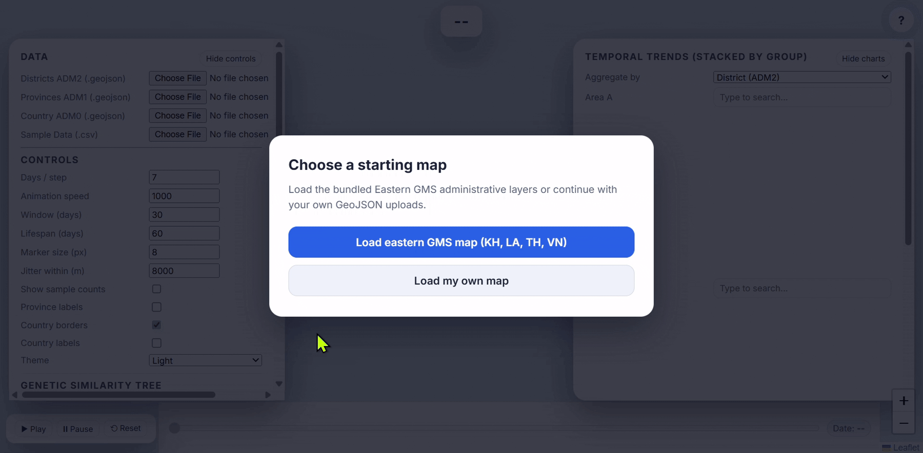
- When the app loads, a dialog appears:
- Click “Load my own map”.
- On the left panel, under Data:
- For “Districts ADM2 (.geojson)”, click Browse and select your adm2.geojson.
- Optional: also load adm1.geojson into “Provinces ADM1 (.geojson)”.
- Optional: load adm0.geojson into “Country ADM0 (.geojson)”.
- After loading ADM2, you should see:
- The map zooms to your country/region.
- A small message like “Loaded X districts. You can add provinces and CSV.”

If you see a message about not finding a GID‑like property, it means the GID_2/ADM2_PCODE/similar column was missing or renamed. In that case, check that your exported GeoJSON still has a suitable ID column.
Loading the sample sheet into EpiGenTracker
- In the Data section on the left, click “Sample Data (.csv or .xlsx)”.
- Choose your prepared Sample.csv or Sample.xlsx.
- If you chose Excel, a panel called “Excel sheet with sample data” may appear:
- Select the sheet that contains your sample rows.
- Click “Confirm sheet”.
- The app parses your data:
- It tries to match each row’s GID_2 to a district in the ADM2 GeoJSON.
- It parses collection dates (or month+year).
- It builds the internal timeline and index.

If everything is OK, you’ll see:
- Dots appear on the map.
- The timeline at the bottom becomes active.
- The “Marker grouping” dropdown (in the legend) becomes enabled with your grouping columns.
If no valid rows are found, you’ll get an error like:
- “No valid rows found. Check column names and GIDs.”
Then check:
- That your ADM2 IDs in the sheet really match those in the GeoJSON (e.g. spelling and the full code, not just part of it).
- That your date column is named correctly and in a valid format.
Controls
Left Panel
Time and map Controls
- Days / step – how many days the timeline moves per click or frame.
- Animation speed – how fast the automatic playback runs.
- Window (days) – length of the rolling window; only samples in the last X days are shown strongly.
- Lifespan (days) – how long a dot stays visible before fading.
- Marker size (px) – dot size.
- Jitter within (m) – the scatter distance around the base location (district centroid or your latitude/longitude).
- Show sample counts – display numbers over districts.
- Province labels, Country borders, Country labels – toggle for extra context.
- Theme – light/dark mode.

Genetic similarity tree (optional)
If you have a genetic distance matrix (e.g. pairwise distances between clusters):
- In Genetic Similarity Tree, load a .tab / .tsv file.
- The app will draw a tree and color tip labels using the same grouping colors (often by Cluster).

For a smooth experience, make sure the cluster names in your distance matrix match those in your cluster column.
Right Panel
Charts
- Compare temporal trends of sample counts by group.
- Choose areas to compare at ADM2, ADM1, or ADM0.
- See counts stacked and coloured by the current grouping (e.g. cluster, species).

Grouping and legend
- The legend shows colored symbols for each category (e.g. cluster).
- Use “Marker grouping” to choose which column decides the colors:
- If you have a Cluster or Group column, it will be offered and often chosen by default.
- Switching grouping will recolor the dots and charts accordingly.

You can also show/hide categories in the legend to focus on a subset (e.g. only resistant clusters).